I had an idea of how I wanted to layout my documentary in my head. Earlier in the course Ken had shown us an online documentary called Capturing Reality.

Capturing Reality is a great resource and has interviews with lots of top directors. The interviews are broken down into different topics. I like the idea of the layout of the project and wanted to use it as a loose template.
Another tip Ken gave me from our tutorial was to actually write out the layout for the project on paper – rather than keeping it locked up in my head. Please excuse the hand writing but below is what I had rolling around in my head.
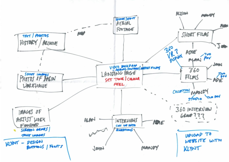
I’m not sure if the plan above was one hundred percent a design layout or more of a check list for the elements I needed to do to complete the project?
Because I hadn’t looked at Klynt since my first year of my MA course, I booked in with Stef for a refresher session. My notes were a little vague from the class and I wasn’t able to make the session that ran this year. I’m glad I did as there were lots of small things she reminded me of in the different windows that needed to be either changed or selected to get the functionality I was needing.
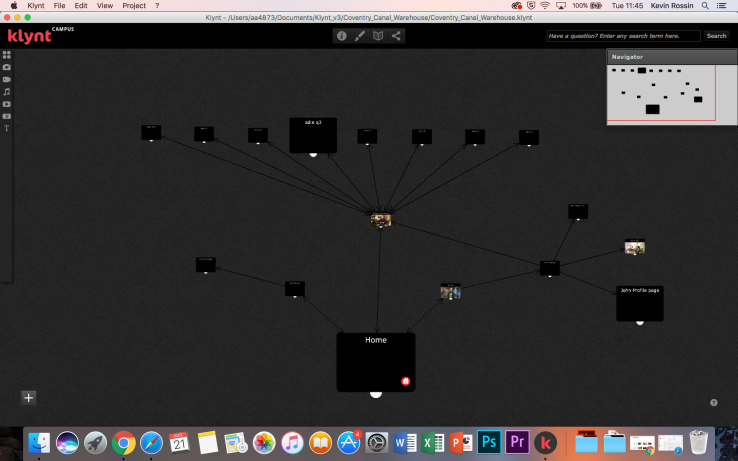
I started to put the layout together, with the homepage leading into three areas, artists, interviews and warehouse. Klynt has a pretty intuitive user interface when build you r layouts. In the image above you can see the storyboard of the project structure as it was starting to be constructed.

The first section I started to work on was the artists page. I needed to split the page equally so that each of the five artist had an equal section. In theory it was a simple process to calculate the pixel amounts to allocate to each section. In reality it seemed that Klynt had other ideas and moved the segment out of alignment even though the co-ordinates were correct. This was the first frustration with the software, the second came very quickly when trying to add text with the artist name above each photo. Once again It was aligned correctly in the builder, but when it was previewed it seem to jump halfway off the page for no reason. To try and combat this I had two options. The first was to use Photoshop to add a text overlay to all the images, something that could cause more problems when Klynt shifted things round for different screen formats, the second was to use the buttons provide by Klynt. Tests with the buttons seem to improve the placements in the preview, however their were substantial design limitations with the package button in Klynt, basically they were pretty dated and ugly. I didn’t have the time to build custom buttons for each individual one required for the project in Photoshop, plus I’m not a graphic designer so I’m sure they would look equally bad.

A different options for the buttons was to use hot spot areas, as in the homepage design above. These animated as pulsing targets and seem to stay close to their designed location when previewing the project in a web browser. Then only draw back was that there was no text label for navigation, you could add a label to appear if you hovered over with a mouse pointer, but that wouldn’t work if using a tablet or phone.

The layout of pages was proving a massive headache. In my original idea, I wanted to have all the interviews on one page in a huge grid system – in the ‘Capturing Reality’ style. As I have talked about above, the problems with the images on the artist page raised their head again. I did seek help with these issue with Stef, who tried to help, however with her experience of using Klynt in the past, the only way to fix these issues was to go into the HTML code when exporting the final project. This was incredibly frustrating at such an early stage of compiling the project. I did try to work round the issues, but it was a test of the site on my phone that finally made me take the decision to ditch Klynt completely.
You can read my post at the time entitled ‘To Klynt or not to Klynt?‘. I hadn’t realised that Klynt was a Flash based site – an archaic web format that is going to be ditched by Adobe in the near future and something that doesn’t work on any modern mobile device or tablet. Even at this late stage, I took the decision to build my own website to host my documentary. All the features and problems I was experiencing could be overcome by perusing my own website design and build, plus I the added benefit of being able to add to and update the site in the future with out being tied to a specific piece of proprietary software that I would lose access to when I finished the course. I decided to use WordPress as the platform to build my new site with, something that is used by millions of users worldwide and supports the latest webdesign formats.
